Table of content for How to make a professional looking website
- Clear Call-to-action (CTA) button
- Keep it simple
- Choose right font and background colour
- Don’t forget small screen
- Sales funnel
Designing and developing a professional-looking business website from scratch can be a daunting task. Making a website look professional doesn’t have to be complicated, actually it could be very easy if you think about it. Your company’s website should be designed and maintained by a reputable design agency that has a track record of designing effective websites and generating traffic towards them. Here’s how to get the job done right.
Although your company may have a great domain name and a stellar business plan, first impressions count. If your website is unappealing—or worse, it looks like it’s run by amateurs—potential customers won’t trust. When your visitors reach your website, they expect a smooth experience. They want to easily find the information they are looking for. A professional website is one way you can provide this. Your website can look great and load quickly! If your business doesn’t have a quality website, customers won’t trust you and might not stay on your site for long.
How can you create a website that encourages repeat visits, a professional look and provides information customers want? Make sure you have a professional site that loads quickly.
So how do we do it? Let’s explore the ways to create a professional-looking website that has an engaging design that excites users without breaking the bank.
To create a professional-looking website, you need professional web design that engages your audience and provides a positive user experience.
Let’s go over some of the most effective tactics and techniques to help you create successful website for your business. Because your company’s appearance is one of the first impressions people have of your business, you need a website that makes you look appealing and professional.
A professional looking website has a clear CTA button
When creating content for professional looking website, you should ensure that your website has a good message that stands out and motivates visitors to take action. Increasing your website’s conversion rates can have a significant impact on your brand image and reputation.
When you’re trying to reach an audience, the first thing you need to do is stand out from all the other voices.
Your CTA could be asking website visitors to subscribe to your newsletter, download an eBook or contact you for further information. Whatever your CTAs, make sure that they are loud and clear.
The best way to get your point across is to make sure that the visitor knows what action to take when they land on your website. A button labeled “Send an email” works way better than a tiny button that says “Learn More.”
Keep it simple

Websites that seem cluttered and disorganised probably will not keep the visitor’s attention. Keeping every important element easy to find will make the website more inviting. What you include in your website, and how you present it, is everything. An overabundance of content, or an unorganised layout, can quickly turn a visitor away. Be clear in your message and assertive in your presentation.
When you create your website that look professional, you decide what your users will see when they visit your site. Are you communicating your brand message? Are you directing their attention to the most important parts of your site? Creating a clean and organised site is one way to attract visitors and focus on the message you want to relay.
If you want users to spend quality time on your website, make it easy for them. Eliminate unnecessary clutter, and avoid jumping right into the features. Keep things simple.
Make a good first impression with a well-organised, easy-to-find website, allowing the visitor to quickly grasp your brand message.
Choose right font and background colour for your website
The font you choose for your professional website has an impact on how your audience interacts with the site. It’s important to choose easy to read fonts. Reading should be a pleasant experience for your audience.
Fonts on a website can affect how your audience interacts with your site. If your font is too small, your audience may not be able to read your site’s contents.
Having fonts that are difficult to read will turn off your website’s visitors, so choose the right font for easy reading. Also, you want people to interact with what you have to say on your website, so don’t make your font selection a complicated
Fonts used on websites can make or break the impression a visitor has of your site. Use fonts that are easy to read to leave your visitors with as positive an impression of your site as possible.
Choose right Colours for your Brand

Colours have meanings, just like fonts and backgrounds. When you create a professional website, you should choose colours that fit your brand, like colours that say what you want to say.
When you’re creating a professional website, you should choose colours that go with your purpose. Different colours are associated with different meanings, which can help create a brand image and give the feel of a website. Take the time to learn about how colours work
The colours you choose for your website’s design can greatly affect the impression your site gives to other people when they view it.
Your choice of colours when creating a website is important. For example, an orange background can make a site appear less official.
The colour you use for your website can affect your brand. A lot of business websites incorporate the colour red because it’s supposed to evoke buying behaviour. But you don’t have to limit yourself. Important features of your site, like your logo and call to action can have accent colour of your brand.
Don’t Forget website for a small screens
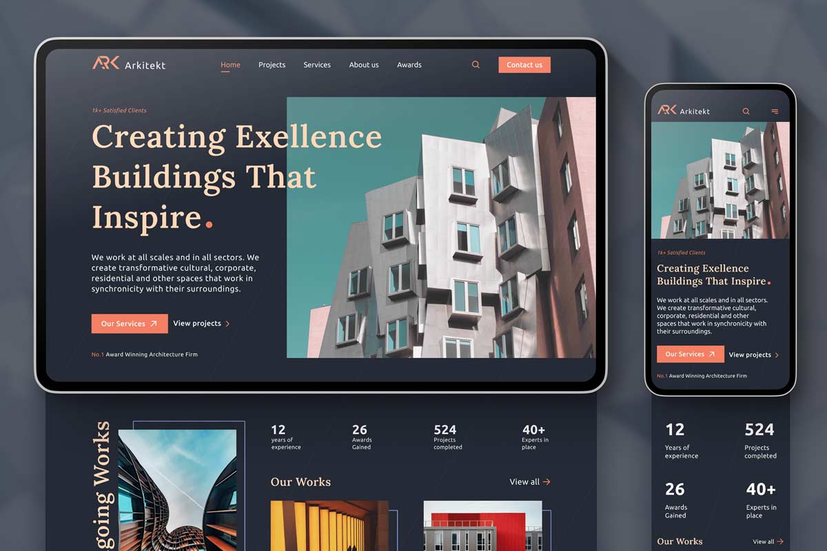
Today most people browse websites from their mobile phones and other small devices, so if you don’t design your website to work with mobile phones and small screens, it looks like you don’t pay attention to detail.
If you’re trying to create a professional site, make sure your pages fit on small screens, in the interest of your mobile visitors.
Today, most people browse websites from their mobiles and tablets, so if your site doesn’t fit on small screens, it looks unprofessional. If you’re trying to create a professional website, make sure it works well on mobile phones and other small
If your business website isn’t formatted for view on small screens, it’ll appear unprofessional.
Website Sales Funnel
Funnels are a series of steps that lead your potential customers from the top of your marketing funnel to the bottom. Each step needs to lead to the next, like a funnel. You need to keep your funnel full of potential customers from the top, so that you can keep your cashflow flowing at the bottom.
Conclusion
An attractive, well-designed website attracts visitors and gives an impression of a successful, well-run business.
If your website looks unprofessional, your company won’t make a good impression, and your company won’t see growth. A professional website, on the other hand, will attract a large audience. To create a professional looking website that can you help you grow, contact Digital & Beyond web design & development team.